Intro
As an author, you might not think about fonts qevery day. But the truth is, what font are books written in can make or break a reader’s experience. Fonts affect readability, mood, and even how your story connects with the audience. Picking the right one is more than just a design choice—it’s part of your storytelling.
In this complete guide, we’ll explore popular book fonts, sizes, and styles. We’ll cover what fonts work best for different genres, plus tips for chapter headings, print formatting, and digital readability. By the end, you’ll know exactly how to choose the perfect font for your book.
What Font Are Books Written In?
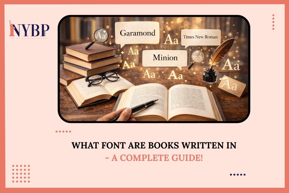
Most printed books use serif fonts for their main text. Serif fonts have small lines or flourishes at the ends of letters. These tiny details make it easier for the eye to follow the text line by line.
Popular serif fonts include:
- Garamond – Elegant and timeless, great for novels.
- Caslon – Classic and warm, often used in historical nonfiction.
- Times New Roman – Traditional and widely recognized.
- Minion Pro – Clean, professional, and versatile.
Serif fonts are ideal for long reading sessions. They help your readers stay engaged without straining their eyes. That’s why most novels, biographies, and nonfiction books rely on them.
Why Choosing the Right Font Matters
Choosing what font is used in books is far more than a design decision—it directly shapes your reader’s experience. Fonts play a subtle but powerful role in how your story is received. The wrong font can make even the most compelling book feel tiring or confusing. On the other hand, a well-chosen font draws readers in, keeps them engaged, and enhances the overall reading experience. Here’s why font choice is so important:
-
Readability
Readability is the foundation of any good book. The right font helps guide the eyes smoothly from one line to the next. Serif fonts, like Garamond or Caslon, create tiny visual anchors that help readers move easily across the page. This reduces eye strain and makes long reading sessions comfortable.
Poor font choices—like overly decorative or condensed fonts—can slow readers down and make your text feel dense or chaotic. Even subtle changes in letter spacing, line height, or size can dramatically affect comfort. Remember, your goal as an author is to let readers immerse themselves in your story, not struggle to decipher it.
-
Tone and Genre
Fonts communicate emotion, sometimes even more than words. They set the mood before the reader even reads the first sentence. For example:
- Thrillers and mysteries often use bold, clean serif fonts to convey tension and seriousness.
- Children’s books benefit from rounded, playful fonts that feel friendly and approachable.
- Romance novels sometimes use elegant serif fonts to evoke warmth and sophistication.
- Business or educational nonfiction usually requires professional, clean fonts like Minion or Times New Roman for clarity and authority.
Choosing the right font ensures that your story’s tone is consistent with the reading experience. It’s a subtle cue that prepares readers for what to expect.
-
Professionalism
A carefully chosen font sends a signal about the quality of your book. Readers often judge a book by its presentation, even before opening it. Fonts that are outdated, overused, or difficult to read can make your book feel unpolished or amateur.
By selecting a font that aligns with your genre, purpose, and design, you convey professionalism. It tells your audience that you respect their reading experience and that you’ve invested thought into every detail of your book.
-
Accessibility
Accessibility is an increasingly important consideration for authors. Certain fonts make reading easier for people with visual impairments, ADHD, or dyslexia. For instance:
- ADHD-friendly fonts like Arial or Verdana provide clear, simple letters that reduce distractions.
- Dyslexia-friendly fonts such as OpenDyslexic or Helvetica have letter shapes that are easier to distinguish.
- Using proper spacing and line height can also improve comprehension for readers who struggle with focus or visual tracking.
Choosing fonts with accessibility in mind not only broadens your audience but also shows that you care about all readers having a positive reading experience. In short, the font you choose is more than decoration—it’s part of your storytelling toolkit. It affects readability, conveys your book’s tone, signals professionalism, and can make your book accessible to a wider audience. For authors, understanding this impact is crucial when deciding what font is used in books.
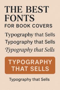
Popular Fonts for Books
When deciding what font do books use, it helps to know what most professional publishers recommend. Here’s a detailed look at popular book fonts:
Garamond
Garamond is elegant, highly readable, and perfect for fiction and literary nonfiction. It gives your pages a timeless feel.
Caslon
Caslon is a classic font used for centuries. It works especially well in historical novels or academic books.
Minion Pro
Designed by Adobe, Minion Pro is versatile and modern. It’s professional without being boring, making it ideal for both print and e-books.
Palatino
Palatino is a bit larger and more open than Garamond. Its spacious letters make it easier on the eyes for long reading sessions.
Jenson
This font has a slightly old-fashioned charm. It’s readable and gives a refined, literary touch to your book.
For headings, authors often use sans-serif fonts like Helvetica, Arial, or Avenir. These fonts stand out while keeping your book clean and professional.
Choosing the Best Fonts for Books
There isn’t a single “perfect” font for every book. The best fonts for books depend on several factors:
- Genre: Romance, fantasy, and children’s books may lean softer and more playful. Business or nonfiction books often use sharper, clean fonts.
- Readability: Avoid highly decorative fonts for body text. They slow readers down and can distract from your story.
- Size: Body text is usually 10–12 points, while headings can be 14–18 points. The right size keeps your book easy to read.
- Medium: Print and digital fonts behave differently. Test on paper and screens.
Remember, your font choice sets the tone for your book. Readers notice it—even if they can’t name it.
Font Sizes: How Big Should Book Text Be?
A common question is, what size font are books written in. The standard is:
- Novels: 10–12 points
- Nonfiction: 11–12 points
- Large print editions: 14–16 points
Line spacing also matters. Aim for 1.15–1.5 spacing for comfort. Too tight makes reading tiring. Too loose feels disconnected.
Fonts for Chapter Titles and Headings
Chapter titles need contrast but should match your book’s style. Here’s how to approach them:
- Sans-serif fonts like Helvetica, Arial, or Avenir work well.
- Bold serif fonts can also add emphasis while staying consistent.
- Avoid decorative fonts for headings—they can distract and look unprofessional.
Tip: Keep heading fonts consistent throughout the book. It makes your design look intentional and polished.
Fonts for Digital Books
E-books come with unique challenges. On screens, fonts need to scale well and remain legible at small sizes.
- Serif fonts still work, but some designers prefer sans-serif fonts like Georgia or Verdana for digital readability.
- Adjustable font sizes in e-readers make accessibility easier.
- Always preview your book on multiple devices before publishing.
Special Considerations for Accessibility
Some readers need extra help with text. Fonts can make a big difference:
- ADHD-friendly fonts: Arial, Verdana, or Comic Neue. Clear letters and spacing help maintain focus.
- Dyslexia-friendly fonts: OpenDyslexic and Helvetica are often recommended.
- Avoid overly decorative fonts like Papyrus or Curlz—they’re hard for most people to read in long passages.
Tips for Choosing a Book Font
Here are practical tips for authors:
- Print First: Fonts can look different on paper than on screen. Print sample pages before finalizing.
- Line Height Matters: Proper spacing improves flow and comfort.
- Consistency is Key: Use the same font family throughout body text. Mix only for headings.
- Test Reader Feedback: Ask beta readers about readability. Their input is invaluable.
- Match Mood: Your font should reflect your book’s tone and genre.
NY Book Publishers Ensures Your Book Uses the Best Fonts to Become a Hit
At NY Book Publishers, we know that choosing the right font can make your book shine. Our team of experts works closely with you to select fonts that enhance readability, match your book’s tone, and capture your audience’s attention. We don’t stop at fonts. We write, edit, design, promote, and publish your book with care. From writing compelling content to creating eye-catching covers and formatting, we make sure every detail is perfect. Our goal is to turn your story into a book that readers love. With our guidance, you can become a well-known author admired by millions of fans. Every font, design choice, and layout decision is made to make your book unforgettable.
Pick the Perfect Font For Your Book
For authors, choosing the right font is more than aesthetic—it’s part of the reading experience. Serif fonts like Garamond, Caslon, and Minion remain the top choices for readability. Pair them with the right size, spacing, and headings to make your book engaging and professional. Whether your book is a novel, memoir, or nonfiction guide, knowing what font are books written in helps you make informed choices. The perfect font ensures your story flows effortlessly and keeps readers immersed from the first page to the last.
FAQs About Book Fonts
-
What font is used for book writing?
Most printed books use serif fonts such as Garamond, Caslon, or Times New Roman. They improve readability and have a timeless feel.
-
What’s the best font type for a book?
There’s no universal answer. Garamond and Caslon are safe choices for most genres. Consider your book’s mood, audience, and medium.
-
Is C5 the same as A5?
No. A5 measures 148 x 210 mm, while C5 is 162 x 229 mm. Size matters for print layout and font scaling.
-
What is the most ADHD friendly font?
Sans-serif fonts like Arial, Verdana, or Comic Neue work best. Pair them with good spacing to aid focus.
-
What is the hardest font to read?
Highly decorative or condensed fonts, like Papyrus, Curlz, or fancy scripts, are tough for long passages. Avoid them in your main text.